Friday, September 10, 2010

Killing FUD Through Clarity


One of the acronyms people like to use around here is FUD. Not the Far-side kind (which I think of EVERY TIME someone says the acronym,) but the triad of Fear, Uncertainty, and Doubt. FUD can kill anything: morale, confidence, even whole projects which are actually great ideas. It comes from the unknown. Ever looked at a particularly difficult day ahead of you, and wonder how on earth you were going to manage it all, and wanted to pull the blankets over your head? That’s FUD.

But just like that bad day, we can kill FUD by breaking down the problem and asserting a plan. It doesn’t even have to be the RIGHT plan! It just has to be something. I can’t count the number of times that I’ve started out with Plan A, then deviated COMPLETELY off-course, and yet somehow finally still arrived at my destination :)

This forces me to conclude that I’m usually starting with the wrong plan. And so I present to you the most basic, and seemingly most idiotic advice I can give for killing FUD: make the WRONG plan, and move forward. It doesn’t matter that it’s the wrong plan. The trick is, we know that it’s probably the wrong plan, we expect it, and we can course-correct as we go.

When we come up with a best-guess and write it down, it’s amazing how much clarity will flood in. Right away, we begin to build an understanding of reasons why that will or won’t work, and can begin to make corrections immediately.

If we never make that first hypothesis, if we never set out in a direction, we can’t learn anything, because there’s no new input. We’re just locked up in our own heads, iterating through what we already know.

When we’re prepared to be wrong, we know that everything does not hang in the balance, and we can learn from our mistakes. Many neuroscientists argue that this is in fact the ONLY way to learn: by making mistakes, understanding the corrections, and learning from them. But until we have a plan and start moving, we can’t even make mistakes. We’re too paralyzed by FUD to take a step in any direction.

Making a hypothesis isn’t about being the decider; it’s not about staying the course. It’s about moving in one direction until we get an inkling that it’s probably the wrong direction, then figuring out why, and correcting. If we are being little scientists, running our little experiments, and we expect to be wrong, it takes the sting out. We can make mistakes without personal failing. And mistakes are how we learn. It’s about progress and revision, not perfection right out of the gate.

So now that we’ve got a plan, and we can see what’s good and bad about it, what about another plan? And another? Think about it. If one plan is great for making some mistakes, learning from them, and building clarity, why wouldn’t 50 plans help you learn 50 times as many things, and build 50 times as much clarity??

This is how some of the best artists work. They come up with 5, 10, 20, 50 different concepts, different hypotheses, and then take the time to understand what is awesome—and what is crappy—about each one. Their final design has fewer flaws than the rest of ours, because they took the time to make their mistakes in the beginning, when they can afford to make them.


Yam Hand and Jelly Man- Rejected Concept Art from BioShock

So the next time you’re stuck on something, you’re scared it can’t be done, you know you have to make progress but you can’t, STOP. Take a deep breath. Make a hypothesis, make 20 of them, and just see where things go. Chances are, you’ll be wrong. And that’s half the fun!
Friday, August 27, 2010

42

Everyone knows that the secret to life, the universe, and everything, is 42.  But what is the question?  I would assert that Happiness is the question.  How do I achieve happiness?  Pay attention, because I'm about to tell you something that can change your life.
Happiness = Perceived Experience - Expectations
Think about it. I can't name one thing where this isn't true. From the inane (changing lanes in traffic) to the existential (what do I want out of my life?), and everywhere in between (keeping our boss happy!), it fits.

Happiness comes from an experience and how we perceive that experience, with a baseline set by our expectations. The higher our expectations, the more difficult it is to be happy with a situation. Lower expectations will result in the same situation being more pleasurable. But it's not just about managing our expectations… it's also about managing our perception of a situation. What details do we notice or ignore, how do we take it all in?


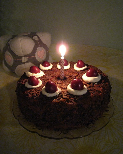
Portal Cake with Companion Cube
The cake is a lie!

Let's say I got a chocolate cake for my birthday. If I had high expectations (I wanted a 3-layer yellow cake with white frosting and 3 candles delivered as part of a surprise party), then I'm probably unhappy with my chocolate cake. But if I had only expectation of "cake", or even no particular expectation of cake one way or the other, I'm probably pretty happy with my cake. If my expectation was that everyone would forget my birthday and there would be no cake at all, then I was probably delighted by my cake!

Now let's look at the perception of the experience. Did I notice that my friend had a very busy day, and still somehow managed to make time to get my cake ready for me? Wow, what a great friend! I'm delighted with my cake! What about other details of the situation? Maybe my sister is being snarky, and fighting with everyone at the party. If I notice this, even though the cake met my baseline "cake" expectations, I will probably be more unhappy (unless snarky is my sister's default modus operandi, in which case hopefully my expectations were already modulated accordingly).

I stumbled across this idea when reading Steve Seow's work on engineering time, which is around how users perceive duration, timing, and responsiveness. Early in the book, he makes reference to Maister's First Law of Service:


Satisfaction = (Experienced – Expected)
Satisfaction = (Perception – Tolerance)
This got me thinking. We cannot change the reality of situations, which are our experiences. They are what they are. The only thing we have power over is our own thoughts: our perceptions of the experiences, and our expectations for the situation.

I don't mean that happiness comes from lying to oneself about what we really want and need. There is a limit to how much we should--or even can--alter our own internal expectations. All I'm saying is that there are ways of seeing things which alter our perception of an experience, and thus alter the happiness we receive from it.

Look at the learning process, and making mistakes. If our expectation is that we should not make mistakes, then learning will necessarily be a painful experience, because mistakes are a necessary part of learning something new. But if instead of bemoaning our mistakes, we look at them from a different point of view, as something we have overcome which has made us better, stronger, wiser and more knowledgeable, then there is a great deal to be thankful for, and even happy about, in every mistake we make.

Wednesday, August 18, 2010

Be the Great Unifier: Seeing what's the same

Thanks to Robby Ingebretsen, from whom I stole this picture

One of the most important things we can do as designers is back off to see the entire picture. This kind of holistic, pattern-recognizing thought style is valuable to teams because in the day-to-day push and shove, it’s all too easy to focus too closely on the trees and forget about the forest entirely.

Knowing each of the infinitesimal differences between this object and that is a necessity when it comes to getting a quality product out the door. It is the unavoidable result of the kind of careful, detail-oriented thinking that avoids bugs and creates elegant algorithms.

But switching gears from this detailed thought style can be very difficult. Once we know each of the infinitesimal differences between this object and that, it easily comes to a point where the objects seem COMPLETELY different to us. We forget that the reason these things have to interact, the reasons we learned the differences in the first place, is that they are often fundamentally the same in some way, or at least closely related.

This is where letting our more innately-human style of thinking take over can really pay off. We have to forget everything we know about object A and object B, and look at them in their normal context with fresh eyes. We have to take off our smarty-pants engineer hats, and put on our user hats. What similarities do we see? Do we often want to interact with them in the same way? Do we always want to interact with them in the same way? When are the differences between them important, and when are they not?

If the nature of a thing defines how users interact with it, then seeing the commonalities in disparate objects defines the common language through which both can be manipulated in the same ways.

It’s important that we not forget that the similarities and differences are highly context-dependent. For example, to someone who is concerned primarily about flavor of food, sugar and sugar substitutes are comparable, because they both provide sweetness. But in the context of a natural-foods-only diet, sugar substitutes are no longer an acceptable equivalent.

As always, the context of a situation must come from our users’ goals and mental models.

Taking a minute, an hour, a day, to go through this exercise can do immense good. If we’re thinking too much (read “more than our users”) about the differences, the result will be a clumsy system that doesn’t work intuitively. Our users will have to tell the system about what they want every time they want it, rather than the system understanding implicitly what should be done. But the same result will occur if we’re thinking less than our users about the differences. If our users think two objects are different and we treat them as the same, the user will have to go out of their way once again to tell the system what they really wanted.

Let’s always try to be Baby Bear: not too much, not too little, but just right.

Friday, August 6, 2010

Caring too much, and how to stop

If I had to settle on one thing as my greatest weakness, it would probably be this: I care too much about everything.  Lest you think this is one of those "turning a weakness into a strength," glass-is-half-full, dancing in the rain sentiments, let me explain why this is a bad thing.

Have you ever heard the expression "If everything is important, then nothing is?"  Well to me, darn-near everything is important, both professionally and personally.

I tend to think I'm Wonderwoman: omnipotent, capable of doing anything and everything.  Help you design this task flow?  Sure, no problem.  Design an Information Architecture for an entire new product?  No sweat.  Debate 50 options for the right control to use on this single wizard page?  Of course!  Design a fully-extensible architecture for the next GUI and still achieve all of our other design priorities?  "...What do you mean you don't think I can??"

But where does it end?  I wake up exhausted in the morning, drag my tired butt to work, pump myself full of caffeine to make it through the day, weigh in on any and all of dozens of issues, go home, eat dinner with my husband, and go to bed.  And the next day it starts all over.  I'm too tired to do the housework, too tired to take part in my hobbies, which all gets left for the weekend when I try to cram a week's worth of personal life into 2 short days.

That interest in everything, which makes me so good at what I do, is also my foil.  And I know that I'm not alone.  All over the US, and in my generation especially, there are little girls and boys who grew up being told they could do anything they could dream of.  But the well-intentioned message back-fired: We grew up believing that we could do anything, but we never learned we couldn't do everything.  And frankly, there just aren't enough hours in a lifetime for that.  But in spite of this, we try.  And then we fail.  And that failure is attributed NOT to the rational reason that it's impossible, but to some enigmatic personal failing.  "Clearly, if I was a better person, I would not have failed."  That path is not one that anyone should try to walk.  It doesn't lead anywhere good.

So how do we stop?  Personally, I stop when I feel that something is "enough."  The problem is, very seldom do I instinctively feel that something is "enough".  The UI could always be cleaner, simpler, smoother, more intuitive.  My house could always be neater.  My dogs could always be happier, more well-adjusted.  Thank goodness we don't have any kids yet! ;)

In my work life, at least, I've finally found a "good enough" indicator.  I recently attended a customer-focused design session where the facilitator presented a methodology for prioritizing improvements.  Here's how it works:

1. We start by building a list of the different improvements we're considering
2. Next, we stack-rank them according to customer priority, where #1 is the thing that customers most want, and N is the least craved feature on our list.  This can be a guess, but it really should be based on customer data.
3. Rank them according to current capability:
     1 = Can't be done at all, no way, no how
     2 = Can be done, but only using one of the competitors' products
     3 = Can be done with our product, but not easily. The solution requires a lot of thought and some effort from our customers.
     4 = Can be done with our product, somewhat easily.  This is where customers are beginning to be satisfied with our product.
     ...
    10 = Bliss. Customers are so happy with it, they tell everyone they meet.

Now we plot our features on this chart:


The relative priority we should place on improving any given feature is equal to that feature's horizontal distance from the 45-degree line.  The idea here is to only give priority to those features which will pay off in customer loyalty.  The lower the priority for a given feature, the less the effort will pay off after a certain point.  According to this method, that point is defined by the 45-degree line.

Shown below here is an imaginary example of 9 features that a team might be considering improving for their next version.

1. Plot them on the chart by priority and capability:


2. Measure the distance from the feature point to the 45-degree line:


Now we can see the relative improvement priority for each of these features:
  1. Feature 2 - with high priority (2) low capability (3), this feature is 6-points away from the line, which means it will give us the most bang for our investment buck: investing a lot in this feature will make our customers very happy.
  2. Feature 3 - still high priority (3), but better capability (5), this feature is only 3 points away from the line, which means that customers won't see as much improvement when we work on it, but they'll likely appreciate the little that they see.
  3. Feature 1 - Even though this was the highest priority (1), because it's already such a good experience, customers will not value improvements as much here as in the previous two features.  This one only gets an investment level of 2 points.
  4. Feature 9 - This is the lowest priority feature, but customers can't do it at ALL today.  This feature gets a score of 1: don't invest much, but do give it a little.
The rest of the features, 4 - 8, are already satisfactory to users.  In fact, Feature 4 in particular is much better than users care about already!  In the real world, this might be like a cellphone that reads my mind to dial: Am I going to pay more for a phone that can do this, or will I choose the phone that doesn't drop my calls as often?  Personally I'd go with the second phone.  Even though the mind-reading feature is wicked-cool, once the novelty wares off I'm going to get annoyed by those dropped calls.  Ultimately that feature is higher priority to me, because I find the existing dialing experience perfectly fine.

I'm so grateful to have found this algorithm, because it creates a stopping place for me.  For anything I'm weighing in on, I can ask myself, in the scope of ALL of the features that this team is dealing with, where does this rank?  After some gut-reaction, back-of-the-envelope graph plotting, I can tell whether it's worth my time to push on an issue, or to let it go.  And do you know what I've found?  More often than not, I can let it go, giving myself more time for the things that really matter.

Friday, July 23, 2010

Building Compelling Experiences

I recently attended a lecture by Stephen P Anderson on the subject of "Compelling Experiences".  While I'm familiar with the topic, and have given moments of thought to the topic before, Anderson's lecture finally crystalized for me why this topic is so important, and what to do about it.

In a nutshell, the principle is this: where Usability removes friction from an experience (thus making it easier to accomplish), Motivation (aka a Compelling Experience) will increase the user's desire to go through the experience.  Anderson has a handy reference picture of this:

Usability removes friction from an experience, Motivation increases the user's desire to go through the experience.  "Paraphrased" from Joshua Porter's original work

I think one of the reasons Anderson's work struck such a chord with me (besides the fact that, let's admit it, he's a FANTASTIC speaker) is because he's marrying many fields of research and work, and distilling it all down to the principles most relevant to design.  That feels right to me, not only because I share his broad interests, but also because many of the great insights and discoveries in history have been made by people who refused to see the world in only one way.  They sought out information on "unrelated" interests.  And then... one day in the bathtub... BAM!!  It all comes together!

Anderson has done the leg-work to assimilate information from fields as disparate as economics, game theory, and neuroscience.  He has recently distilled this information in the form of a series of cards, similar to the IDEO Method cards, which he calls Mental Notes


Each card lists a principle of psychology, a description of how that principle drives each of us, and gives some ideas on how we (the designers) might use this principle in our work to make our experiences more compelling.  And the illustrations are a hoot; every time I flip through the cards, I find something that makes me laugh out loud!

Anderson is no slouch when it comes to walking the walk, either. He has clearly used his own principles in the construction of this deck: The box it comes in is beautiful (Aesthetic-Usability Effect), the cards are succinct (Curiosity, Need for Certainty), funny (Humor Effect, Peak-End Rule), and references to the original psychological principle names lends them weight (Authority).  And the illustrations by Kevin Cornell are both funny and really help us quickly understand the concepts (Conceptual Metaphor, Visual Imagery).  Full disclosure: Anderson probably has no idea who I am (except maybe that annoying girl in the third row with all the questions), and has not asked for any kind of endorsement.  I'm just an avid supporter of his work!

One of the reasons I think all of this is so important is that it's a perfect suppliment to usability.  Take another look at the picture above.  In a perfect world, designers would be able to take that hump down to zero, making a perfectly smooth, flat, frictionless surface.  Now come back to the real world.  There will always be applications with learning curves, things which require us to understand before we proceed.  Every question we ask our users increases the size of this little hill.  But without asking questions, we can never learn, we can never make the system do what THEY want it to do (as opposed to what we would have chosen for them).

This is where motivation comes in.  If we can make the experience compelling, make the user WANT to go through what we're about to put them through, we and they will be better off for it.  Think about it like the recent changes in dentist's offices: HD TVs, headphones, clean-while-you-sleep procedures... all designed to make the experience more enjoyable, less of a chore.  Dentists are hoping that if patients actually ENJOY their check-ups more, we might show up more often.  And I think there's something to that.  Now if only they would hand out gamer points for scheduling my appointments on time...

Wednesday, June 30, 2010

(Not) About the Importance of Design

This article is NOT about the importance of design.  Those who know me best know that I'm a bit of a contrarian... I tend to play devil's advocate in arguments just to see what will happen, I do the opposite of what I'm told just to see if I can, and in college I once wrote a reactionary "Anti-Feminist Manifesto" because I was so tired of being told by my women's studies classes about what a victim I was of The System and The Patriarchy.

I have to stop and clarify a bit here.  This article will NOT BE an Anti-Design Manifesto.  For one thing, I've grown up a bit since college, and along the way realized that victimhood aside, I am a feminist.  For another, just because I'm tired of hearing about the importance of design doesn't mean it's not important.  I just don't think it's important to CONTINUE TALKING about the importance of design ;)

My reasoning here is threefold.

First of all, it's all been said.  Read the first chapter of just about ANY design book, and you'll get inundated with the reasons why design is important.  Most of them come down to a basic fact: if you don't set out to design your [noun], you'll end up with a badly designed [noun].  I cannot count how many times I've heard this phrase.  Many times it's stated far more eloquently than I just said it, but the basic argument is the same.

My second reason is that talking about the importance of design is preaching to the choir.  I've already picked up your book, attended your lecture, turned on your video, whatever.  If I'm here, and your content is not SOLELY ABOUT the importance of design, chances are that I've already bought into the message.  I don't need to hear it again, because I already know it by heart.

Lastly, talking about the importance of design is pointless because if you don't get it by now, you're probably not going to.  I assert that with all of the "democratization of design", all of the numerous sources who will tell you it's important, all of the cultural shift that has transitioned towards intentional design, unless you've been living under a rock, you've heard some (or most) of it by now.  And if you've heard it, and you still don't buy it, I can talk about the importance of intuitive information structures and seamless interaction models until I'm blue in the face; I still don't think you're going to buy what I'm selling.  And that has to be OK.  It's a waste of my time to convince someone who doesn't believe in of the importance of deliberate, intentional design.  I'd much rather spend my time working with someone who at LEAST buys into the story A LITTLE, and then show them just how far that story will take them.

You may, by now, be wondering "If it's all been said, and you're soooo tired of it, why do you keep reading/watching/listening to these sections?  Why don't you just skip them?"  Frankly, it's partially because I'm a sucker.  I enjoy the eloquent phrasing, the reiteration of an important point.  But also it's because these first chapters often set the tone for the rest of the material.  These sections define what the AUTHOR thinks are the important concepts in the "importance of design" message.  For example, you might be able to guess from reading this article that things like "information structures" and "interaction models" are important to me, because I called them out in my examples.  That gives you some important context about where I'm coming from.  And personally, I'm all about context.

I've seen some great diagrams explaining the different facets and personas within the design process.  What I think would be cool is if we designers could use some of these diagrams, and color in the parts we feel apply to us, and to our content.  So without further ado, I will show MY PERSONAL design emphasis pictogram here.  I hope both that it comes in handy for you other context-o-philes, and that this is the start of a broader industry trend.

My emphasis order is:
1. Information Architect
2. Interaction Designer
3. Visual Designer
4. Copy Writer

.

A big thank-you to Robby Ingebretsen and the videos at .toolbox, from whom I stole the original UX Venn Diagram.

Tuesday, June 29, 2010

"The sea is so great and my boat is so small..."

...how is my feature supposed to get found in all this mess???

Discoverability is one of the harder issues any designer faces.

Part of it is the advertising aspect: pick me, pick me!!  The problem with this is that it's not ALWAYS the right time for your feature to be visible, and if everybody puts a happy flashing glow around their feature, then nothing stands out.  But if you don't stand out at all, how will people see you?  Furthermore, you don't want to be the flashing glowing icon on the screen when people DON'T need you.  Then you're the annoying kid in class with his hand up… "why can't he just keep quiet??"  The key is figuring out what makes you special to the user, be that when they need you, and then get out of the way.  Just like in the Tao of Steve, "Be there, be brilliant, be gone."

Some of it comes back to the launch point discussion.  What is in the users' mind when they need your feature?  What is on their screen?  What information do they have at hand, and what information do they still need to get?  Or what do they need to do?

Once you know these things, picking the right name is what it's all about.

Naming is hard, but completely worth the investment in time:  The right name will make people stop and take notice.  The wrong name will at best make your feature ignorable, and at worst make you a subject of mockery, ridicule, and shame.


Apple is great with names; my personal favorite is TimeMachine, their automated backup solution.  It brings to mind the idea of freeing yourself from linear time, and the ability to instantaneously move to whatever point in time is important to you, to experience that time firsthand.  And isn't that exactly what the user wants when they want a backup solution?  "This stupid computer isn't working right.  It was working right yesterday!!" Ok then, let's just go back to yesterday!

On a tour of the Redhook Brewery in Seattle, I learned that one of its founders supposedly thinks a great way to name something is to take two completely unrelated words, one of them containing the letter K, and put them together.  According to him, the result will be something that sticks in peoples' minds.  I can't speak to the effectiveness of his strategy, but I admit I used it to come up with my blog name... :)

But regardless of how you come up with a name, be it the lightening bolt of inspiration, some strange algorithm involving the letter K, "bible dipping," or any other method, make sure your name speaks to your target audience.  And the only way to do that is to test.  Test TEST TEST!!  I didn't really test my blog name other than to ask a few trusted friends what they thought of it, but that's just a blog.

For a shipping product, you want to know that your name resonates with your audience, that it has the right connotations and brings up the right feelings.  Make sure you can say the name aloud: show a few people the name on paper, and ask how they would pronounce it.  You want to make sure the name is pronounceable, and that people don't come up with some completely alternate way to say it that you don't like.  If it has an acronym, try out the acronym aloud.

On the subject of acronyms, I have to say this: for all our sakes, if the acronym is as interesting or more interesting than the name itself, please, STOP.  Think again.  You probably have a bad name.  The technology world simply does not need one more acronym.  Acronyms make great nicknames for internal discussions, but they're terrible for customers.  And if the acronym is so much easier to say than the name itself, maybe you should give some more thought to a name that rolls off the tongue.

Friday, June 18, 2010

Where do I begin?


Begin at the beginning… and go on till you come to the end: then stop.” Lewis Carroll, Alice in Wonderland
In my industry, people don't WANT to use your feature, they want to do their jobs.  They didn't wake up this morning and think, "wow, today I want to spend all day using that new feature I found yesterday!!" That may be how things end up, but it certainly was never the goal ;)

So how does your feature help them do their job?
  • What is on their mind when they need your feature?
  • What information do they have in front of them?
  • What are they doing?  (Or at least, what are they trying to do??)
That's your launch point.

"But what if my feature starts from nothing??"

It's certainly easier to create features that add tasks and actions to existing information and objects than it is to create features which start from nothing.  But even if the feature starts from nothing, the user still has a mental model of how things are, and how they should go.  What is in that model?
  1. What things are part of their mental model?
  2. What does the user think is the right place to start?
  3. What are they already familiar with?
  4. Is there anything that exists already?
Hint: the answer to question 4 is always "YES!"  Even if they don't have a computer, they probably have a spot they could put it in.  Think about the set of things that already exist for the user.  What are the environments and tools already at their disposal?  Where do they spend their time?  What do they like to do for fun, and how do they like to do their work?
If you want people to use it, your new feature should feel as familiar as possible; this applies especially the launch point. If (for some immutable reason) your experience has to be fundamentally different from what they already know, you can use your launch experience to ease them into your new world.

I like to think of designing features in terms of getting a new job.  You want your customer to "hire" your feature, to add it to the set of tools they use.  Before your customer will hire you, they will interview you to make sure you will do the job well.  They want to know that you're smart, that you're a hard worker, that you're not a crazy psycho who will steal all the paperclips.

A lot of people ask "why do I need to spend so much time designing an experience that the user will only ever see once, maybe twice in their whole lives?"   To these people I say, "would you show up for a job interview without making sure your clothes are straight and your teeth are brushed?

Your launch experience is your interview with your customer.  Metaphorically speaking, if you need to take the extra 2 hours in your schedule to make sure your clothes are dry-cleaned and pressed beforehand, that time will be well invested, even if they never see that outfit again.  It helped create the first impression that got you the job.

A little bit of background...

In my work life, I'm a UX PM for Microsoft SQL Server Management Studio.  To the real world--those of you NOT working in the design industry or at Microsoft--that means I design user interfaces for Microsoft's premiere database tool.

A lot of people give me funny looks when I tell them where I work.  And I get it... SQL Server (and Microsoft in general, I know,) is not exactly known for its fantastic UI.  In fact they've both got a history of some pretty crummy UI.  SSMS (the tool my team develops) is difficult to use, idiosyncratic, and has no real design standard other than using another team's crappy UI to justify your own.  And those are the more polite things I have to say.

I once went to a lecture from a man who was giving career advice based on his life and work experiences at SQL Server... he was the sort of person who commands a lot of respect around here.  Anyway, I doubt he thought there were any UI folks in the audience when he made the offhand comment that if you want to progress your career in deep technical thinking, SQL Server was the place to be, but that "if you want to progress a UI Design career, well, maybe you should work someplace else."

I disagree.  I think this is a great place to grow my UX career, because I have a unique opportunity to shine: I know that whatever I do, I'm going to make users happier than if I'd never been here at all.  And after several years, I know I'll be able to point to the legacy I've left behind, and have something to be proud of.  I'm part of the design revolution. 

I could go work for a team known for fantastic UI, and I know I'd learn a lot about how other people do it.  Maybe I'd learn to avoid many mistakes I've had to learn the hard way.  But at the end of the day, I couldn't point to the interface and say, "if it hadn't been for me, that wouldn't have been there."  Call me conceited, but that gets me up in the morning.  And the accountability keeps me honest, and working hard.

I started my current job early in 2008, when my boss decided to take a chance on an unknown person based only on my obvious passion for the subject.  At the time, I was working as a tester for another team.  I knew nothing about SQL Server.  I'd never designed anything a real user would see.  I had one (pathetic) design course under my belt.  And I was full of opinions.

I'm still full of opinions.  And I aim to make sure my boss never regrets his decision...